We asked a team of 16 of our editors and graphic designers to weigh in on their top selections for the 21 different magazine covers published between Oct. 1, 2014 and Oct. 1, 2015.
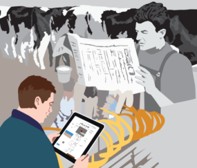
Our staff’s top pick, receiving eight votes, was our Sept. 12, 2015 image, featuring a robot farmer and drone technology. Kevin Brown, graphic designer and director of production, illustrated the cover.
“This was hands-down the coolest cover illustration I have seen,” graphic designer Kristen Phillips said. “It is well composed, executed and thought out. It celebrates looking to the future of robotics in the dairy industry.”
“From autonomous cars to the possibility of water on Mars, our advances in science and technology are rapidly expanding,” said production editor Fredric Ridenour. “The colors complement each other well, and the hovering drones show how new technology is even affecting the agricultural industry. Adding a baseball cap to the robot was a nice touch by the artist as well.”
See what the staff at Progressive Publishing had to say about their favorite cover photos.
Three other covers all tied for second place, each receiving seven votes from the staff. Two of those three are special projects designed and then photographed by the talented Kristen Phillips.
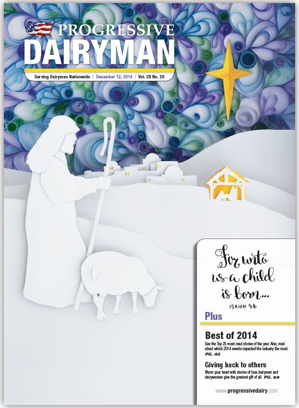 “This reverent Christmas cover should be hung in every home,” said editor Lynn Jaynes of Phillips’ Dec. 12, 2014 issue cover. “It’s very symbolic for me. I appreciate the juxtaposition of the simplicity and humility of earth with the sophistication and glory of heaven. Yet, heaven and earth are eternally linked through Christ in the manger.”
Phillips created the cover by using a technique called paper quilling, which involved more than 40 hours over the course of a year of cutting, rolling, curling, looping and twisting tiny bits of paper.
“I find myself exploring the curls of the sky every time I look at this cover and then being directed by the star to the gold-colored manger, which is the whole purpose of it,” Kevin Brown said. “Amazing effort and execution on Kristen’s part, and she nailed it. The color is fantastic with a nice balance of cool blues and greens complemented by the yellow-orange of the star, windows and manger.”
Phillips’ other noteworthy cover was designed for the July 1, 2015 issue. She created an image to capture a cow’s digestive system, using string wrapped around pins, all anchored to a wooden canvas, built by her husband.
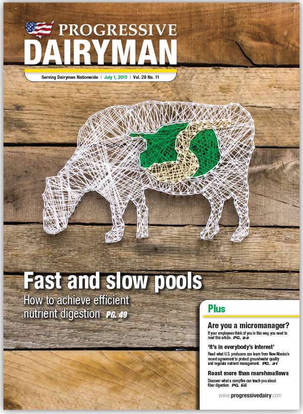 “This cover is awesome for its out-of-the-box thinking,” said graphic designer Ray Merritt. “We do a great job with our photographic covers. It is refreshing to do something different.”
“I love this cover, not only because it looks cool and ‘strings together’ the dairy cow’s digestive system, but also because it was hand-crafted by one of our very own Progressive Publishing staff members,” said editor Peggy Coffeen.
Learn more about Phillips’ creations using these links:
While the top three selections were illustrations, one photo did make the staff’s list of favorite covers.
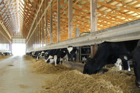
The Feb. 7, 2015 issue featured a futuristic-looking image of Kirt Lindley of Hyrum, Utah, and his fodder-growing setup. The photo was captured by Fredric Ridenour, while the accompanying story was written by editor Walt Cooley.
“Just the stark, overly saturated colors on this cover are very noticeable and memorable,” said graphic designer Corey Lewis. “I never would have thought that a scene like this would appear on the farm.”
Graphic designer Sarah Johnston agrees that the cover is out of the norm for a farm publication.
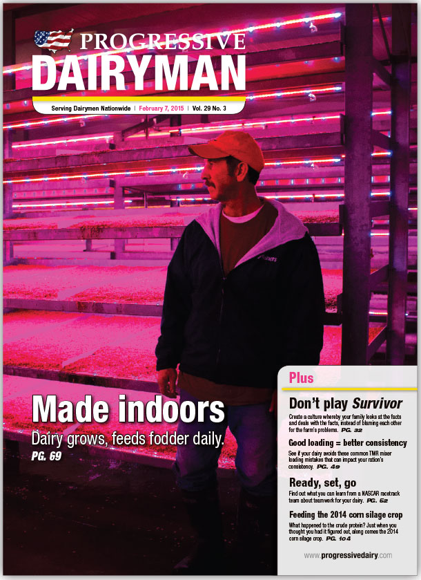 “It’s neon pink!” she said. “This issue’s cover always catches my eye and arrests my attention. I also like that the subject isn’t looking directly at the camera. It makes my mind wander to what else is going on outside the parameters of the image.”
“I think all four of these covers represent the many talents and variety of skill sets of our team,” said Progressive Dairyman editor-in-chief Walt Cooley. “We look forward to bringing you more unique images and illustrations in 2016.” PD
