


We asked a team of 16 of our editors and graphic designers to weigh in on their top selections for the 21 different magazine covers published between Oct. 1, 2014, and Oct. 1, 2015. Here are the individual comments and votes from some of the staff members who voted. Be sure to leave a comment with your own favorite cover from the past year.
See Progressive Publishing’s top cover photo picks here.

Lynn Jaynes, Editor
Dec. 12, 2014 issue
This reverent Christmas cover should be hung in every home. It’s very symbolic for me. I appreciate the juxtaposition of the simplicity and humility of earth with the sophistication and glory of heaven. Yet, heaven and earth are eternally linked through Christ in the manger.
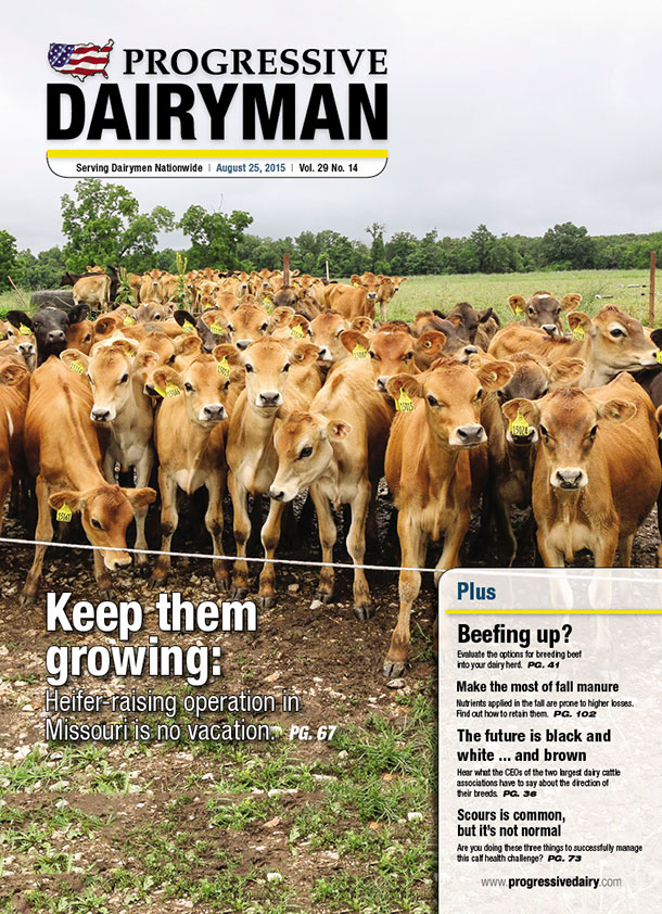
Aug. 25, 2015 issue
I’m not one to humanize animals, but I can’t help laughing at this cover because the eyes of those young cows remind me of the youthful eyes in my Cub Scout den. My Cub Scouts have that same eager, curious look – the look that is always pushing their opportunity windows, and relying on the leader to guide their next move. Priceless. (If only I could get the Cub Scouts to look in the same direction at the same time.)
July 1, 2015 issue
The more I strive to understand dairy nutrition, the more I learn of the complexities of the ruminant system. The string art is not only visually appealing with contrasting textures and clever art – it also symbolizes to me how connected and symbiotic the cows' systems are, and how much caffeine I will likely need as I try to figure out all their relationships.
Julie Vasquez, Graphic Designer
July 1, 2015 issue
I love photographed art. It's easy to photograph a photograph, but this piece has texture and life. Kristen did an excellent job!
Dec. 12, 2014 issue
I like this for the same reasons as I like issue 11. It's unique, captures my attention and the dairymen don't see images like this every day or in every issue, so it makes it stand out.
Sept. 12, 2015 issue
So it's not on purpose that I chose all of the non-photographed images in this year's cover photos; it's just that these stand out in my mind. A reader would pick this issue up, be curious and open it to learn more.
Oct. 19, 2014 issue
The Oct. 19, 2014 issue is a close runner-up too. I love the depth and layers in it. There are almost three separate but together layers of scenes.

Sarah Johnson, Graphic Designer
Sept. 12, 2015 issue
The illustration centering so heavily around technology is a nice switch up from the usual cow and farming photos. The colors go well with the branding of the magazine – yellow highlights that match the Progressive Dairyman logo yellow and blues with grays that allow for those yellows to pop. The diagonal perspective of where the robot is looking fits well with the layout of the magazine cover, and it makes a nice flow for the eye.
Feb. 7, 2015 issue
It's neon PINK! This issue always catches my eye and arrests my attention. I like that the subject isn't looking directly at the camera; it makes the mind wander to what else is going on outside the parameters of the image. The visual lines and center placement of the subject lets the eye wander around the layout, but always coming back to the subject's face.
Aug. 25, 2015 issue
Complementary colors of the greenery with the bright red hair of the calves works well here. The tags on them also tie the photo into the layout color (yellow). The gray sky makes for nice negative space/balance. It helps that the calves are cute! There's so many of them.

Kevin Brown, Director of Production
My choices in countdown order:
3. July 1, 2015 issue
All three of my selections are examples of breaking away from our norm, so really this comment applies to all, but I really like that it is something different. It is visually interesting because of its unique take and contrast of natural wood texture and man-made string and nails.
2. Feb. 7, 2015 issue
Of all our photo covers, this is my all-time favorite. The color is exciting and yet draws you in to read why we used such an electric colored cover shot. It’s bold; that’s what I like about it.
1. Dec. 12, 2014 issue
I find myself exploring the curls of the sky every time I look at this cover and then being directed by the star to the gold colored manger, which is the whole purpose of it. Amazing effort and execution on Kristen’s part, and she nailed it. The color is fantastic with a nice balance of cool blues and greens, complemented by the yellow orange of the star, windows and manger.

Mike Dixon, Graphic Designer
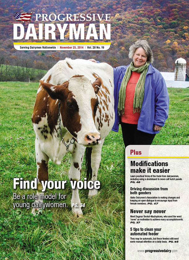
Nov. 25, 2014 issue
The small, traditional family farm may or may not be the correct business model, but it feels good. It brings back memories from my youth, and talking to the family farm producers recently has been a joy. The personal farm and animal care along with the obvious 365-days-a-year commitment made by generations of family is a trait largely missing from today’s society.
March 12, 2015 issue
Cory's illustration does an excellent job of illustrating the level of control and management modern technology affords today's dairy managers. On one side, it shows the distance it puts between the manager and the animal. On another side, it shows how connected to both animal care and production indicators a producer can be.
Sept. 12, 2015 issue
Kevin's illustration shows the continued move towards automation the commercial dairy is making. The main piece of technology in the illustration is shown in human form and portrays the need for a continued human presence. The face shows intelligence, concern and compassion, all traits that can't and shouldn't be removed from the operational formula. Mostly ... just cool.

Karen Lee, Editor
Dec. 12, 2014 issue
The starkness of the white compared to the beautiful colors of the night sky is what caught my eye with this cover. Sadly, though, the picture doesn’t quite give this piece of art its full due. The actual 3-D piece of art where the scrolls of paper pop from the background is amazing. It can be found on a wall in our office in Idaho alongside many other great works of art from our talented team.
Feb. 7, 2015 issue
Like many of our covers, I didn’t see this one until I pulled the magazine from my mailbox. As I unfurled it to see the other mail the postman tucked inside, I stopped in my tracks (in the middle of the road) to learn more about why this issue suddenly looked like something my 6-year-old would want to hang on her wall.
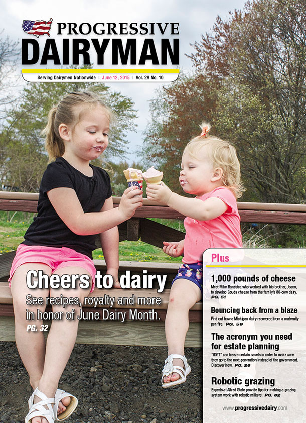
June 12, 2015 issue
Who doesn’t love a couple of cute kids enjoying a little dairy goodness in a cone? Knowing how much these two girls mean to the photographer makes this cover even better.

Carrie Stockebrand, Graphic Designer
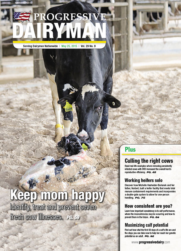
Top pick: May 25, 2015 issue
Second: Aug. 25, 2015 issue
Third: July 19, 2015 issue
I like them all for the same reasons. They are sharp and bright without too much going on in the background.

Kristen Phillips, Graphic Designer
Nov. 25, 2014 issue
I love the colors in this cover. They are vibrant, and inviting. It makes me want to learn why this woman is making a difference in the dairy industry.
July 19, 2015 issue
This image is crisp, well-balanced and compelling. There isn't a lot of color, but it focuses on what progressive dairymen do – take care of cows and make them comfortable.
Sept. 12, 2015 issue
Hands down, this is the coolest cover illustration I have seen. It is well composed, executed and thought-out. Looking to the future of robotics in the dairy industry.

Jenna Hurty, Editor
Dec. 12, 2014 issue
The first time I saw this, I was surprised that it was made out of paper. I think it’s a pretty creative piece, and I really like the colors they used in it.
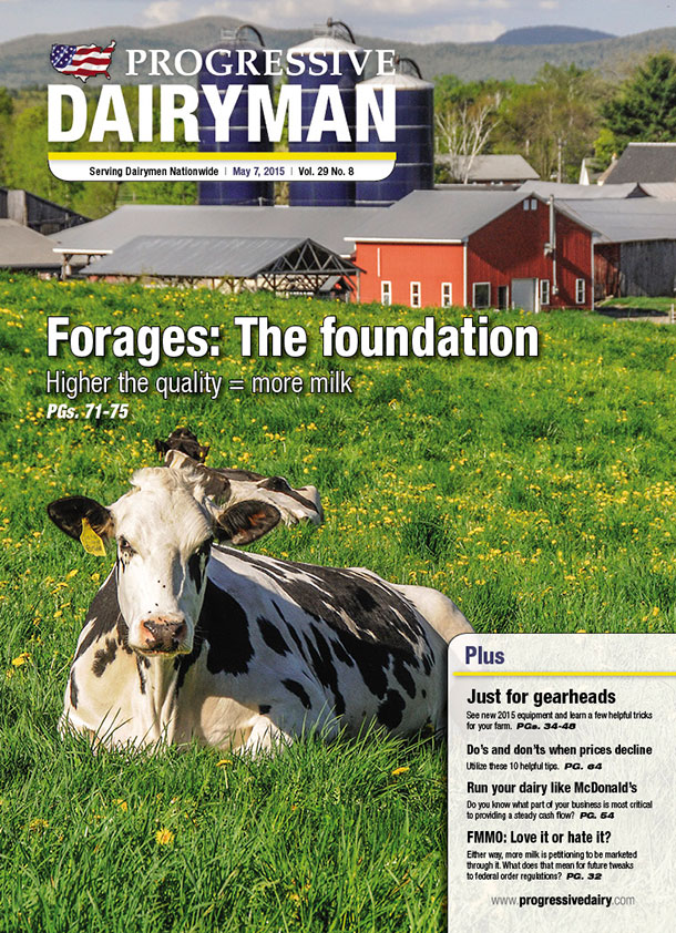
May 7, 2015 issue
I love how bright the colors are in this picture. The green really makes everything else in the picture stand out. Also, the picture is well laid out and balanced.
July 1, 2015 issue
I really like this one because it highlights the digestive tract in a creative way and really makes this nutrition issue stand out.

Ray Merritt, Graphic Designer
Feb. 7, 2015 issue
I chose this one because it was the boldest color we have ever done. It represents a forward-thinking idea to conserve and maximize resources for the dairy.
March 12, 2015 issue
I loved this cover for the illustration and perspective. It is interesting and eye-catching.
July 1, 2015 issue
This cover is awesome for its out-of-the-box thinking. We do a great job with our photographic covers. It is refreshing to do something different.

Corey Lewis, Graphic Designer
Nov. 25, 2014 issue
This was the only one that I noticed out of the bunch where it showed interaction between the animal and the owner. It's nice to see that interaction every once in a while.
Feb. 7, 2015 issue
Just the stark, overly saturated colors on this cover are very noticeable and memorable. I never would have thought that a scene like this would appear on the farm.
Aug. 25, 2015 issue
This one is just fun to look at. The sheer amount of cows in the image is enough to keep your attention and makes me want to learn more about what’s going on at this operation.

Fredric Ridenour, Production Editor
Feb. 7, 2015 issue
The colors (purples and reds) are different than what we normally see in the dairy industry. The lighting is almost space-age in nature and creates questions as to what this is all about in the reader's mind.
July 1, 2015 issue
Simple but bold, I love the mixed media in this image. The string art on a bare-bones, wood-slat background, combined in a well-lit photograph, work together beautifully and give the overall cover a clean, old-fashioned feel.
Sept. 12, 2015 issue
From autonomous cars to the possibility of water on Mars, our advances in science and technology are rapidly expanding. The colors complement each other well, and the hovering drones show how new technology is even affecting the agricultural industry. Adding a baseball cap to the robot was a nice touch by the artist as well.

Peggy Coffeen, Editor
July 1, 2015 issue
I love this cover, not only because it looks cool and “strings together” the dairy cow’s digestive system, but also because it was hand-crafted by one of our very own Progressive Publishing staff members.
June 12, 2015 issue
Nothing says June Dairy Month better than cute little kids and ice cream! To me, this cover also represents the promise of the next generation of dairy producers, as they are PD Editor Emily Caldwell’s nieces. Surely, Auntie Emily will teach them well!
Dec. 12, 2014 issue
This artful image so beautifully depicts the eve of Christ’s birth. It also displays the creative talent of our Progressive Publishing staff. PD
Which cover did you like best? Leave a comment below!
PHOTO 1: Dec. 12, 2014 issue.
PHOTO 2: Sept. 12, 2015 issue.
PHOTO 3: Nov. 25, 2014 issue.
PHOTO 4: May 25, 2015 issue.
PHOTO 5: May 7, 2015 issue.
PHOTO 6: Aug. 25, 2015 issue.
PHOTO 7: June 12, 2015 issue. Staff photos.

